Goals
Chesapeake Regional’s 15-year-old intranet had been causing a host of issues for its viewers and editors. So much so that internal employees stopped utilizing the clunky, confusing platform. Chesapeake needed a solution that would empower employees to find and create content within minutes.
Intranet UX Research
Our team began by digging into the core pain points of the current intranet experience and functionality by holding a variety of stakeholder interviews.
From our research we found that:
- Content viewers experienced a significant amount of stress when attempting to find the required information or simply navigating after logging in.
- Editors did not have the appropriate tools to successfully add content and ensure straightforward consumption.
We knew that in order to deliver a simple yet encompassing solution for both roles we must establish new information hierarchy norms, consolidate content entry flexibility, and create redirects for user paths that once abruptly ended.
Creating Intranet Wireframes
The Chesapeake team requested to leverage Drupal templates versus a custom build in order to get the product in front of employees as soon as possible.
Our UX team took the above UX findings and provided CRHS with low-fidelity wireframes that outlined essential core Drupal template components that the team would need in order to best deliver a catered experience to meet both user group needs.
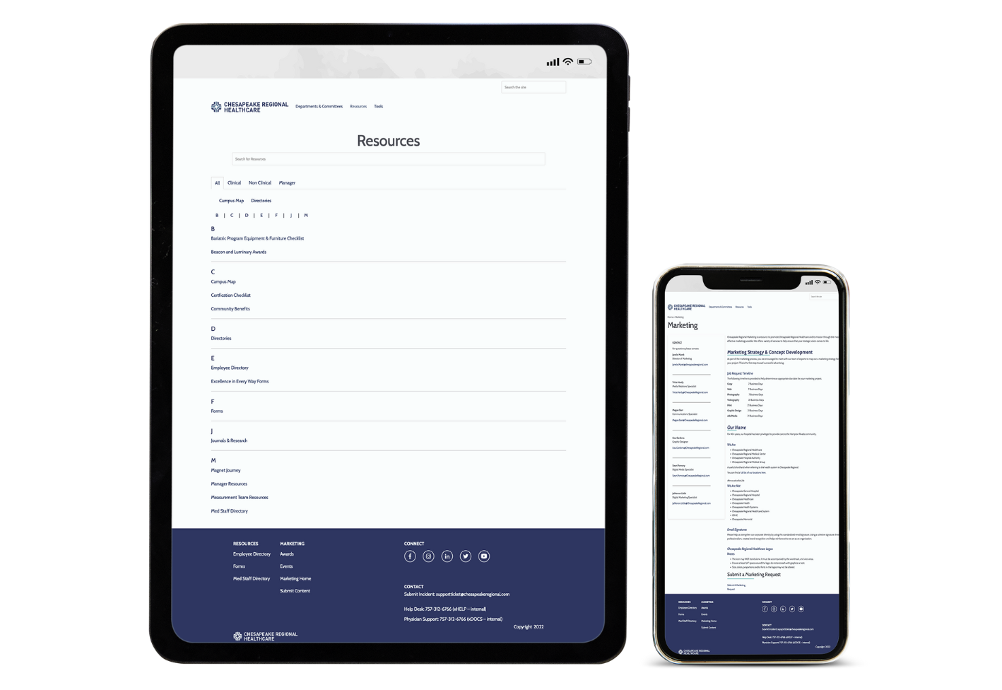
Ultimately, the search-to-find and adding content experiences were substantially improved. The intranet now:
- Allows content managers to have controlled flexibility with every page they design.
- Guides users to appropriate content through simplified navigation and hierarchy.
Development Highlights
Our Engineers helped Chesapeake:
- Find the right Drupal templates to best fit their needs.
- Addressed security concerns by hosting on Pantheon.
- Increased general flexibility of building pages by utilizing specific Drupal-templated themes.


