Goals

Chesapeake Regional Healthcare struggled to find new and retain customers. Losing out to larger, well-known competition, Chesapeake Regional Healthcare approached Modea to redefine its customer journey to better meet the users’ needs.

Research

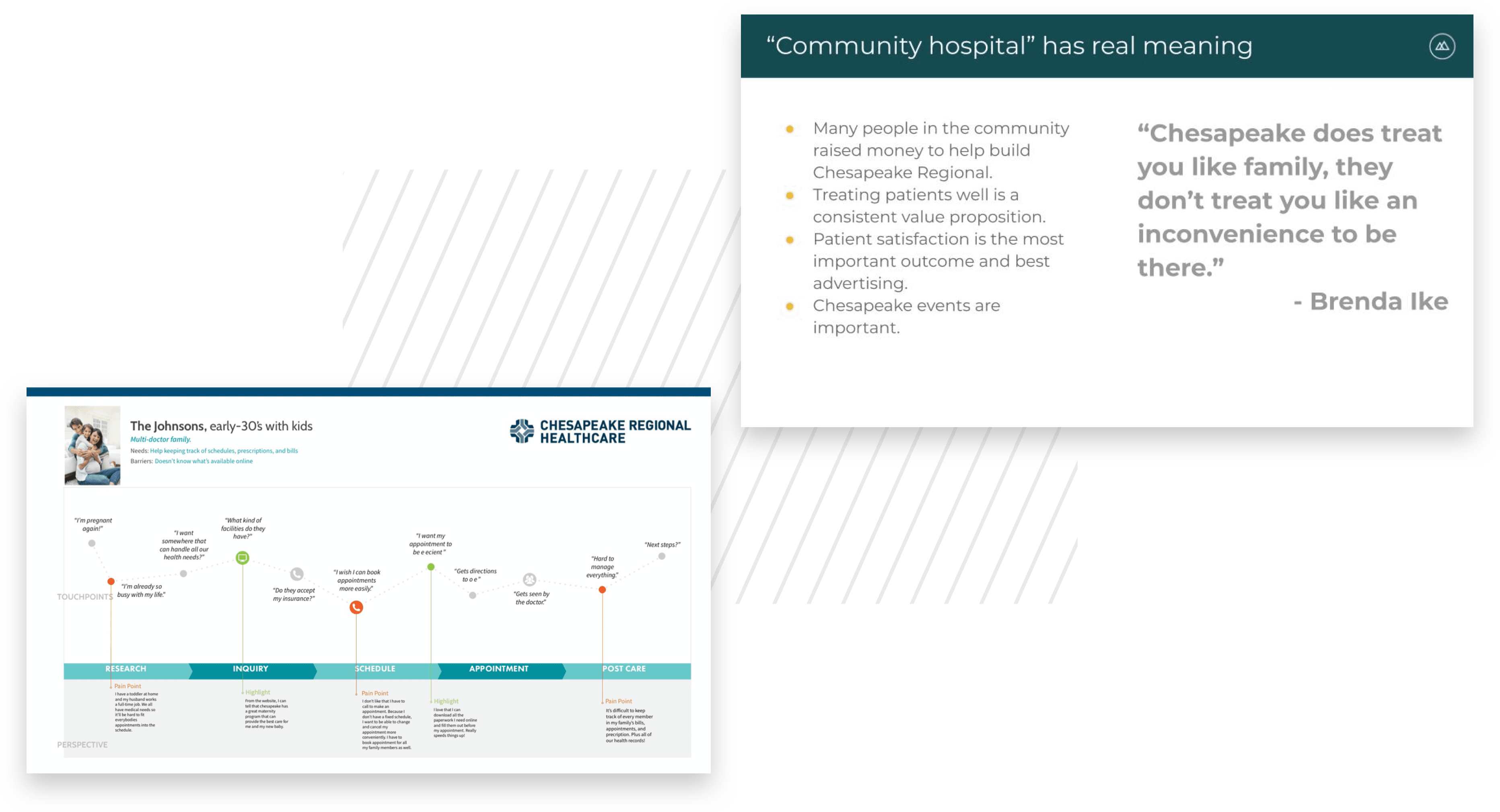
We began by conducting user and stakeholder interviews to decipher the needs of those using chesapeakeregional.com the most. Initial consumer data showed that the majority of traffic entered the site via mobile, however, the digital experience did not cater to the handheld experience. Additionally, these visitors were focused on executing transactions, such as finding a location or physician, scheduling an appointment, or searching for the desired service. While internally, the Chesapeake Regional team desired a more flexible and easy-to-manage site. Our goal became clear; create a progressive, mobile-first user experience whose web architecture would allow for seamless integration of third-party software tools and overall enhance management functionality of the site.

Case-Study_Chesapeake-Regional_Research_Desktop-1
Case-Study_Chesapeake-Regional_Quote-1
“Taking these key mobile-first elements into consideration, the new design heavily focuses on primary patient transactions that drive growth of scheduled appointments.”

Design

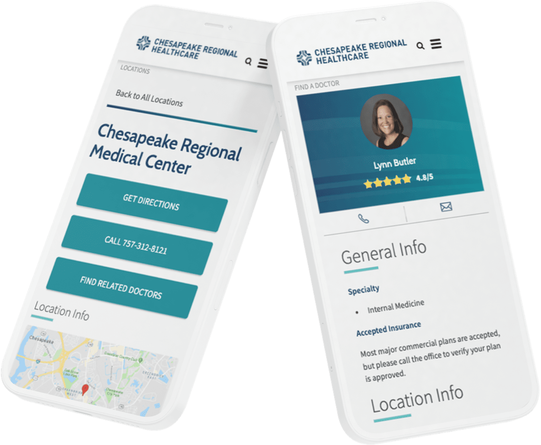
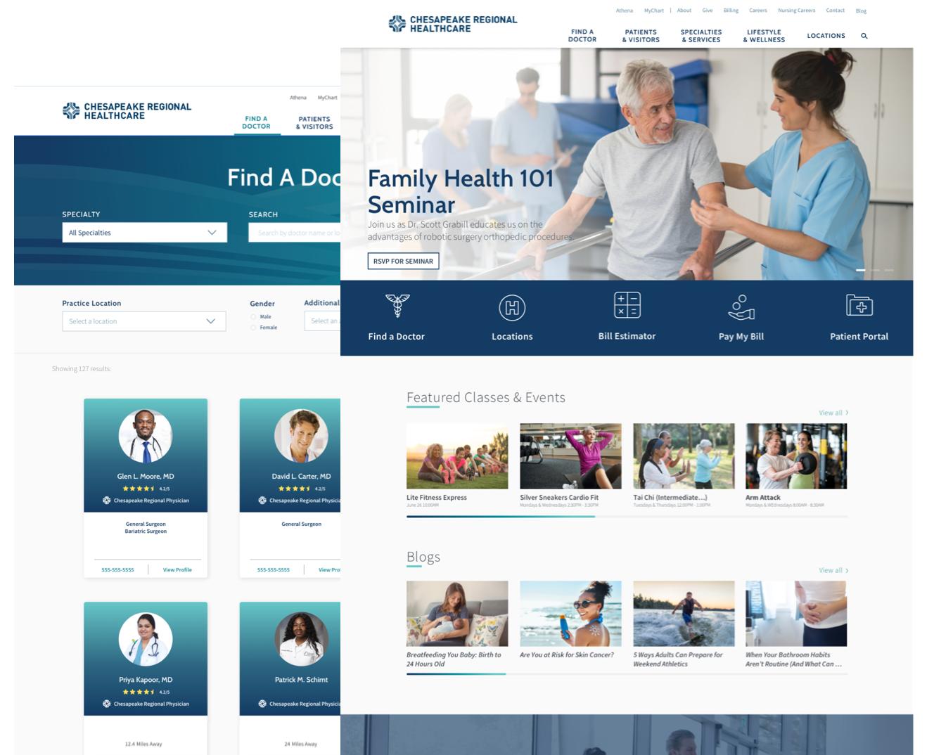
Through a series of surveys, in-person interviews, and user testing our User Experience Designers quickly isolated four main user groups. To directly meet the need of each persona and a mobile-first user experience, user flows and call to actions were streamlined and crafted for small screen usability.

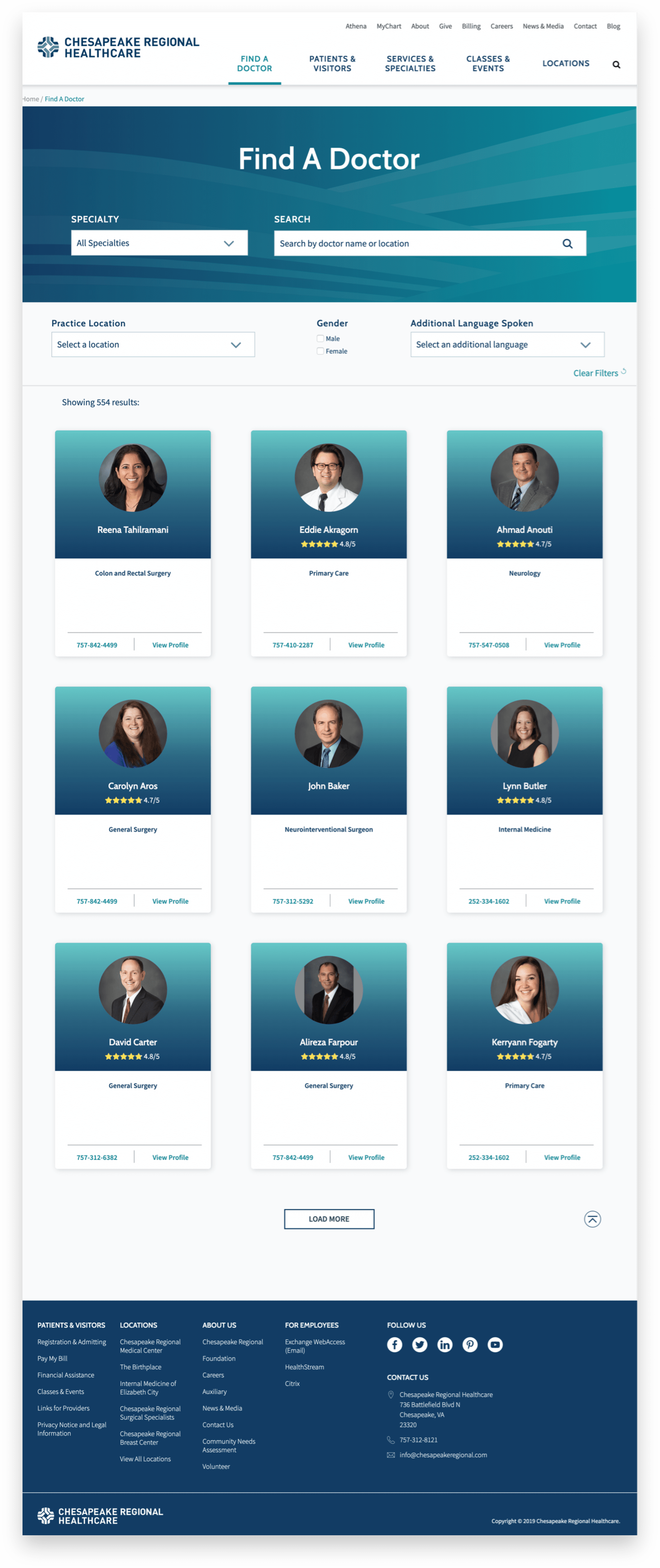
Focused on maximizing the speed and simplicity, the new site offers users the complete healthcare digital experience from the palm of their hand. Now a user can book an appointment, find a doctor, pay a bill, or search for a nearby location, all while on-the-go.

Development

  • The Agile process, used by our Project Managers, focused on building the most valuable functionality to Carilion’s consumers.
  • Carilion’s search experience was amplified via Solr by strategically selecting synonyms and allowing for natural language search.
  • Complete refactor of Carilion’s sitemap, user navigation, and content strategy.
  • Replatformed to Drupal 8 in order to create more content management workflow efficiencies and optimize overall site performance.
  • Use of Angular allowed our Engineering team to quickly implement design to accommodate increased usability and modern style.
Case-Study_Chesapeake-Regional_Design_Long-1

Outcomes

The modern and user-friendly experience brings the main call to actions to the forefront and allows users to interact with the features they use most through personalization.

Seven months post-launch, valuable interactions that drive revenue have increased significantly.

  • +25%Mobile Engagement
  • +13%Traffic to Detail Pages
  • +35%User Retention Rate
  • -27%Mobile Page Load Speed

Awards

Digital Health Awards

  • Website - Digital Health - Bronze

Web Awards

  • Healthcare Website